Strawberries Inc. is a local performance arts company that brings theatre off the stage and into on-ground events, campaigns, business propositions or private celebrations. They’re the corporate, client facing arm of Singapore youth theatre collective, Patch and Punnet.
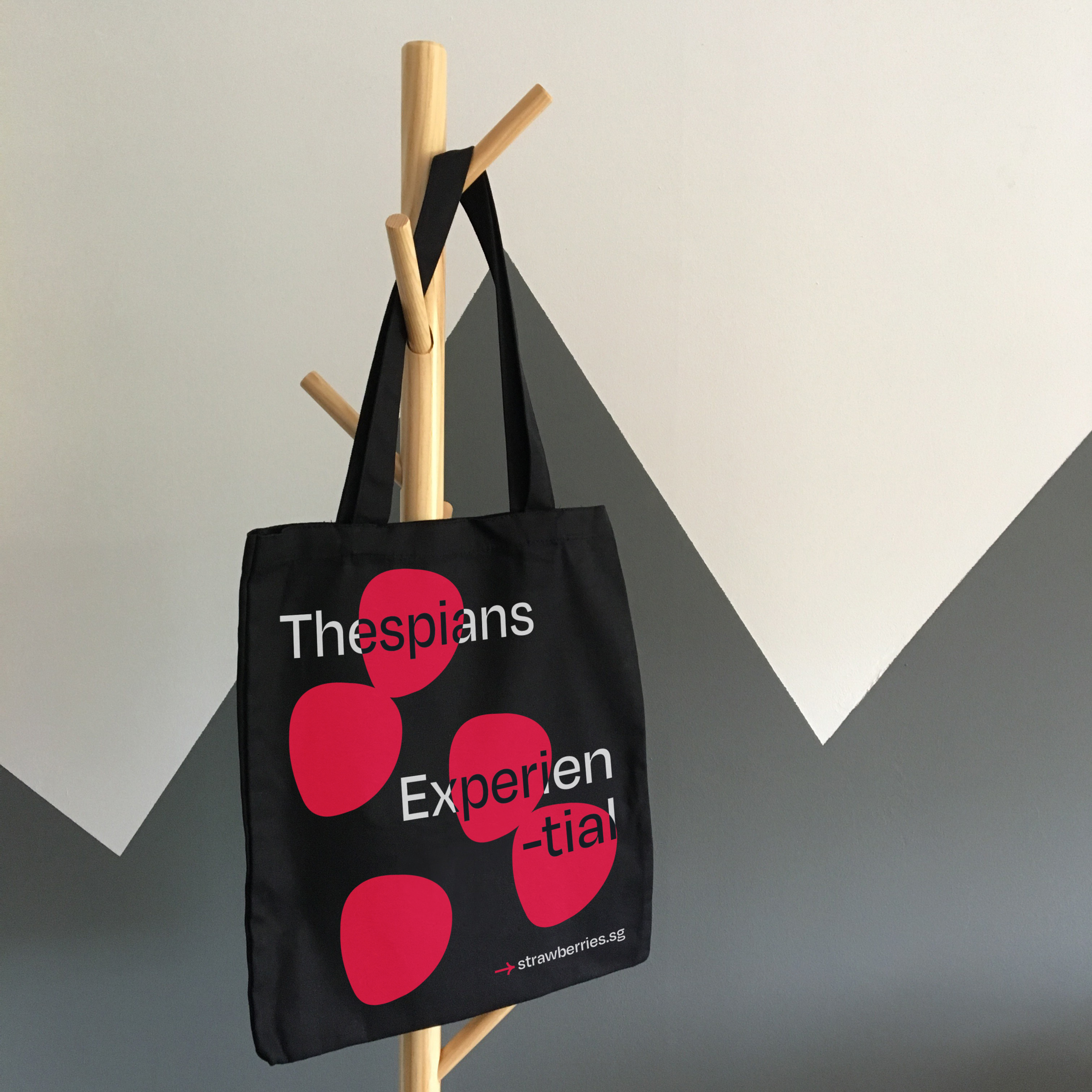
This project documents the rebranding of Strawberries Inc., including a new logo, namecard and applications to different brand merchandise. My role included creating a new logo, colour palette and visual tone for the brand.


As the corporate, client-facing arm of Patch and Punnet, we wanted to build a brand that reflected the youthful character of the brand and it’s members, but also retain a sense of reliability and professionalism.
In order to achieve this, we first tackled logo design. As the company’s mission promise is “for millenials, by millenials”, we believed it was important that the branding remained appealing to younger professionals. We decided to have the logo in lower caps to bring across a more casual tone of voice, while choosing a cleaner yet still friendly type. This helped us establish legitimacy within the logo, while allowing it not to take itself too seriously. The chosen font, Degular (Bold), is a clean sans-serif font however it’s humanistic quirks returned a relaxed quality, overall creating the balance we wanted for Strawberries Inc.
The stylised terminals (done by our Creative Director, Kapilan Naidu) softed the hard edges of the font, hence creating a softer logo that felt more palatable for the brand’s more corporate clients.
We decided to take inspiration and retain some similar sentiments from Patch and Punnet’s branding, in order to establish the connection between the two brands. Therefore, we adapted from Patch and Punnet’s brand mascot (Mr. Berry) and derived a simplified strawberry shape that we used in Strawberries Inc.’s logo.
This strawberry shape’s also lent itself as a strong, simple yet recognisable branding element that could be used as a logoicon, as well as a pattern that could be applied across Strawberries Inc.’s branding. This created distinguishable branding for Strawberries Inc. while still having a subtle callback to Patch and Punnet.


While the logo is simple and clean, the logo icon and vibrant colour scheme is easily adapted to retain the edgy and fun tone of voice, and can be then applied to branding collateral. Overall, the branding creates a professional, straightforward and clean look at a glance, but is subtly honest and upfront about the brand’s easy-going attitude.


Credit:
Agency: Kult Studio & Gallery Pte Ltd.
Art Director and Creative Lead & Logo Design: Astrid Ana Jansen
Creative Director & Logo Design: Kapilan Naidu


